A terrible thing that happens most every week is that the New Yorker comes out. Haha just kidding, kind of. The New Yorker is fine, where else could I read the work of Lena Dunham. The terrible thing that happens most every week is that the New Yorker cover comes out, and in response people lose their shit. “Did you see the New Yorker cover?” someone tweets, a picture of the New Yorker cover attached, which is a drawing of a garbage can shaped like the White House. “So powerful.”
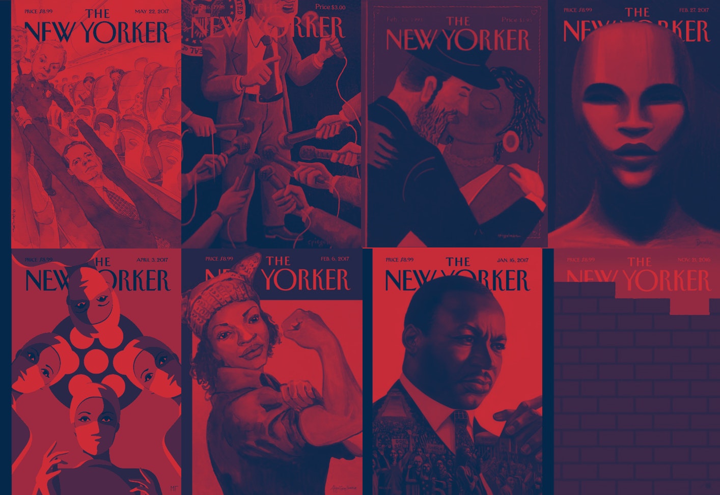
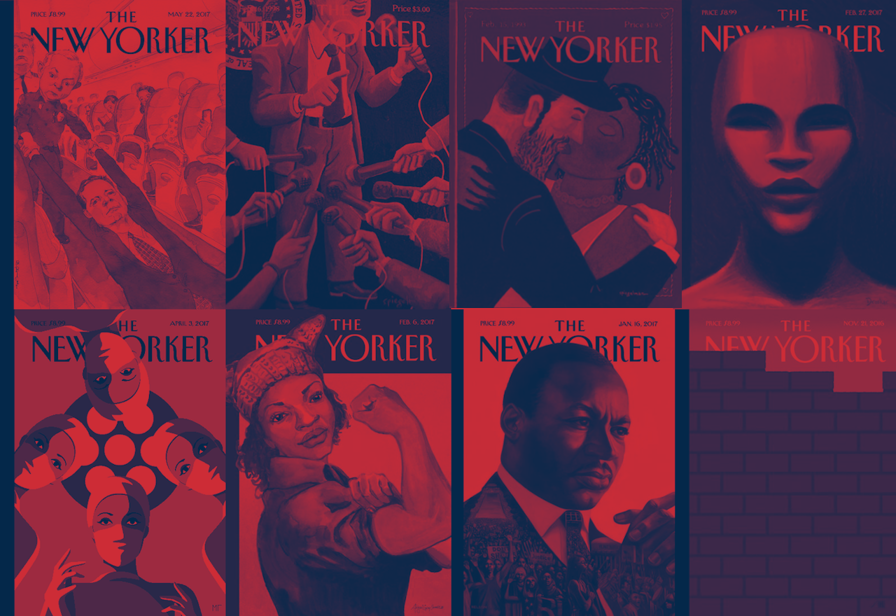
The cover of the New Yorker is a certain kind of cultural touchstone for liberal elites, the media, people obsessed with the media, conservatives who think the covers are too liberal, and journalism school students. Tina Brown, who edited the magazine from 1992 to 1998 and made it pretty incredible in many ways, also established the tradition of commissioning newsy, controversial cartoon-drawn covers. These covers are not known for their light touch.
Perhaps the most infamous of the Brown-era covers was a 1993 cover by Art Spiegelman that depicted a black woman kissing a Jewish man as racial tensions between black people and Jews simmered in Crown Heights. This cover was so controversial that Brown appended an “unprecedented” editor’s note to it, featuring some very Pollyanna-ish commentary from Spiegelman: “This metaphoric embrace is my Valentine’s card to New York, a wish for the reconciliation of seemingly unbridgeable differences in the form of a symbolic kiss,” he wrote. “I’m also painfully aware that the calamities facing black communities in New York cannot be kissed away. But once a year, perhaps, it’s permissible, even if just for a moment, to close one’s eyes, see beyond the tragic complexities of modern life, and imagine that it might really be true that ‘all you need is love.’”

Oh my. Another Tina Brown cover, also by Spiegelman, featured a bunch of people pointing microphones that look like penises at Bill Clinton’s crotch. Heh.

The style of the New Yorker cover has not changed much since the Brown era. This is kind of strange because the world has changed a lot — you can get cold brew in a can, no one smokes, and Tina now runs an eponymous “live media” company that is “dedicated to summits, salons, flash forums and debates” (?). But the covers still deploy the same kind of ham-handed, tendentious, smarmy Clinton-era satire, in which gay jokes were perfectly acceptable fodder and Bill Cosby was a lovable father figure. And the results of continuing this tradition of cudgel humor and clunky social commentary are bad, even though everyone pretends they’re not.
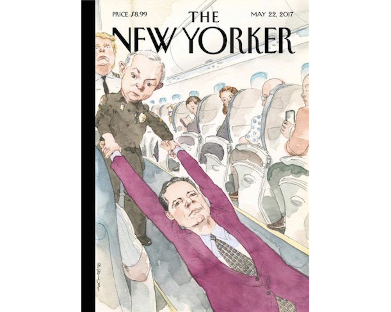
Exhibit A is this week’s cover, drawn by longtime cover artist Barry Blitt, which features Attorney General Jeff Sessions dragging former FBI Director James Comey through an airplane aisle while Donald Trump looks on. This recalls, of course, United’s horrific mistreatment of a passenger on one of its airplanes last month, which was caught on tape and retweeted to the ends of the earth. So, let’s map out this “joke.” James Comey as David Dao, the Kentucky doctor who was dragged off the plane. Okay. Jeff Sessions is a Chicago transit authority official? Sure. And Donald Trump is a pilot. Why not. So... what is the joke here? Was James Comey offered a voucher to leave the government but refused? We could say that James Comey is an unruly passenger on the airplane that is America, but that ignores the racial element of the United debacle. Is a joke good if it just throws shit at the wall and hopes that nobody notices it doesn’t exactly work? No. That is a bad joke. Is it a joke good if it is so “highbrow” that plebes can’t understand it? No. That is a bad joke.
In February, the New Yorker did, as it always does, an Academy Awards-related cover. This one was titled “#OscarsNotSoWhite” and featured a painting of an Oscar statuette, drawn as if the statuette were not a man but a woman of color (the Oscar statuette was modeled after the body of Mexican filmmaker Emilio “El Indio” Fernandez, so it’s actually already #NotSoWhite, but let’s not be dragged down by such details when we’re doing performative wokeness). Writing on the New Yorker website, the magazine’s art editor, Francoise Mouly, vaguely explained the impetus behind the cover. “Recently, the world of moviemaking, which will celebrate its eighty-ninth Oscars ceremony on February 26th, has been criticized for its lack of diversity onscreen and behind the scenes. On and off social media, the critique has been represented by the hashtag #OscarsSoWhite. ‘I’m glad this is finally beginning to change,’ Eric Drooker, the artist behind this week’s cover, said. ‘Movies have a powerful influence on us. They can stimulate — or limit — our imaginations.’”

Okay, so, one point for good intentions. And the cover is a powerful image, especially because the Oscars are super racist and fucked up and should probably just be canceled. But let’s cast that critical gaze in the direction of the New Yorker. Eric Drooker may be a talented artist, but his painting raises a question of who can create what art and why. Having a white man draw a non-white woman for a magazine at which diversity is famously lacking is, in fact, not changing very many things at all, but simply reinforcing a cycle in which surface-level simulacra is mistaken for progress.
In an interview with the Huffington Post in 2008 regarding the controversial Blitt cover that featured Barack Obama, in a shalwar kameez, and Michelle Obama, in revolutionary gear, fist-bumping in the Oval Office while an American flag burned in the background, the New Yorker’s editor, David Remnick, said he wanted the magazine’s cover art “to speak for itself” and didn’t want to “explain jokes.” This is understandable. Artists are not responsible for the ways in which their work is interpreted; things will be construed in any number of directions, and here Remnick unfortunately had to defend his artist's use of satire: “I’d rather be clear than there be lingering misconceptions about what Barry Blitt was exploring,” he told HuffPost. But editors have a responsibility to make sure what they publish is clearly communicated to their audience. There’s a distinct line between editorial art that is provocative and editorial art that is incoherent, and the New Yorker has largely walked on the incoherent side.
In his book The Art of Controversy: Political Cartoons and Their Enduring Power, Victor Navasky, the former editor and publisher of The Nation and the publisher of many controversial cartoons, including the infamous “Screwing the World,” which depicts a grotesquely rendered Henry Kissinger literally fucking planet earth, asks: “When a periodical commissions an artist to render an image to accompany an essay, is the image meant to illustrate the writer’s point of view or to be the artist’s own statement?”
Damn. Really good question. Let’s adapt it for the New Yorker. How often is the magazine’s cover art coming from a place of faux-wokeness, clumsily trying to speak to an audience not represented within its walls? And is it strange that those covers are so well-received by a preening public? Do they actually make any sense? I would say the answers to these questions are often, yes, and no.
*Get Leah Letter in your inbox.