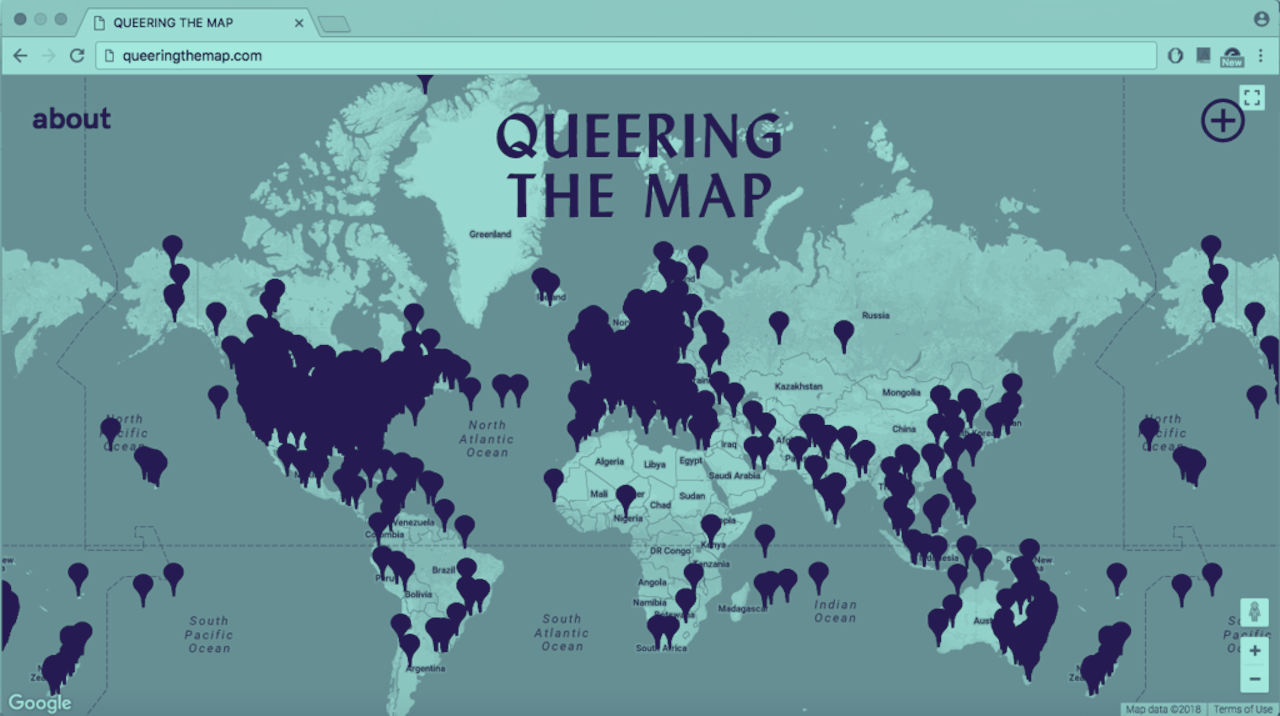
Waste some work hours with this interactive map database
The confluence of different GPS technologies have led to more and more stunning map and data visualizations. Added bonus: casual map lovers have something to explore during periods of procrastination.
Last week, to the joy of data nerds everywhere, the Ash Center for Democratic Governance and Innovation at Harvard University’s Kennedy School of Government launched a database of interactive maps that use public sector data to visualize various city and community services, histories, and statistics. It sounds dry until you check out the selection of 200 mapping projects. Particularly interesting, deep dive-worthy ones include a map of immigrant communities across the U.S., a map of public art in Philadelphia, a visualization of the variety of trees in New York City, a map detailing the history of redlining and other forms of housing discrimination in Louisville, Kentucky, and a map of access to high-speed internet in Kansas City, Missouri. There’s enough there to lose an entire afternoon with.


