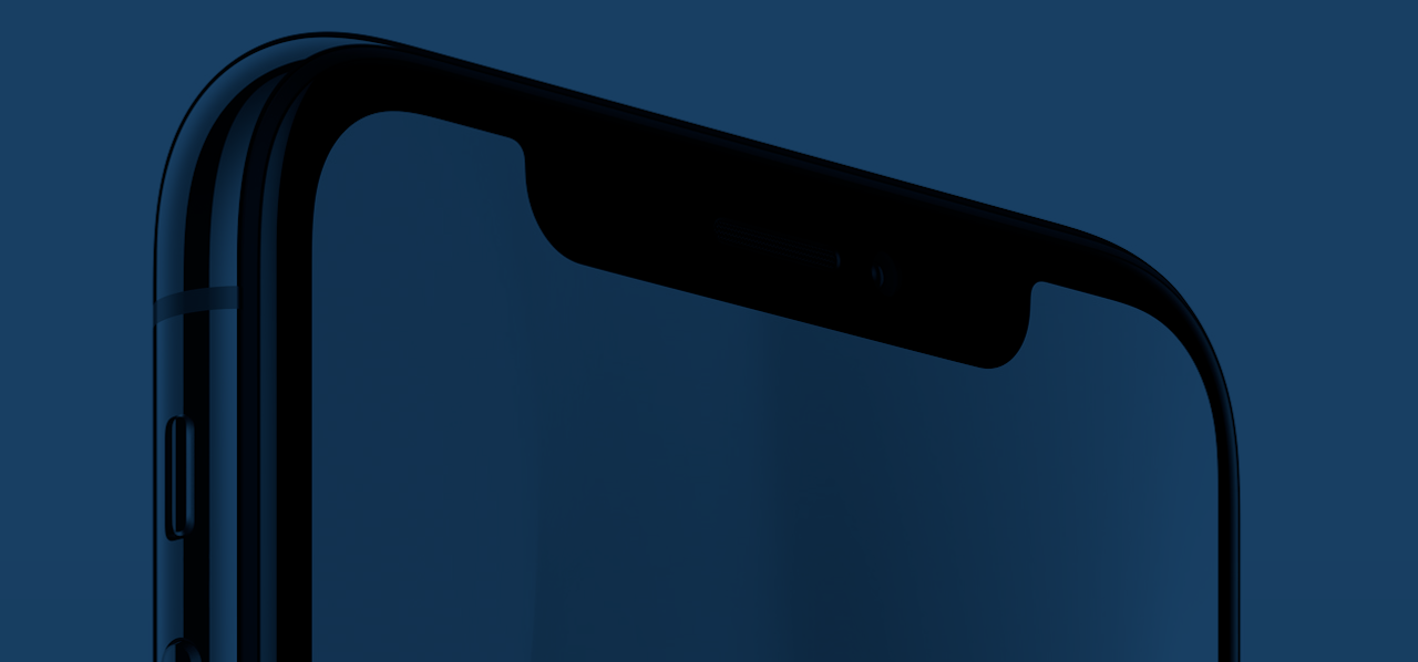
The “notch” on the new iPhone X is not just strange, interesting, or even odd — it is bad. It is bad design, and as a result, bad for the user experience. The justification for the notch (the new Face ID tech, which lets you unlock the device just by looking at it) could have easily been accomplished with no visual break in the display. Yet here is this awkward blind spot cradled by two blobs of actual screenspace.
It is, put plainly, a visually disgusting element. One which undermines the core premise of the iPhone X’s design (“all screen”), and offers a feature as an excuse which is really an answer in search of a question. To wit: no one wanted or asked for Face ID, and the feature actually raises new concerns about security for users. From a performance standpoint, there is hardly a differentiating factor between the iPhone X and iPhone 8 Plus beyond display size and type — the former is a flagship only because Apple wants it to be one.
It is, put plainly, a visually disgusting element.
Plenty has been written about the mind-numbing, face-palming, irritating stupidity of the notch. And yet, I can’t stop thinking about it. I would love to say that this awful design compromise is an anomaly for Apple. But it would be more accurate to describe it as the norm.
Apps that embrace the notch on the new iPhone X look bad. Look better with a black background for the status bar. Quick comparison #iphonexpic.twitter.com/3o4bJQC4NB
— Carlos Gavina (@carlosgavina) September 12, 2017
Once upon a time, Apple could do little wrong. As one of the first mainstream computer companies to equally value design and technical simplicity, it upended our expectations about what PCs could be. “Macintosh works the way people work,” read one 1992 ad. Rather than requiring downloads and installations and extra memory to get things right (as often required by Windows machines), Apple made it so you could just plug in a mouse or start up a program and it would just... work. Marrying that functionality with the groundbreaking design the company has embodied since the early Macs, it’s easy to see how Apple became the darling of designers, artists, and the rest of the creative class. The work was downright elegant; unheard of for an electronics company.
Stretching perhaps from the introduction of the first iPod in 2001, through the release of the groundbreaking iPhone 4 (and subsequent refinement with the iPhone 5), Apple was regularly lauded as best-in-class when it came to hardware and software design and the synchronicity of those elements. Reviewers (yes, even me) fawned over designs that lovingly referenced “classic Leica[s]” and boasted software that turned simple smartphone cameras into true photography tools.
But things changed.
In 2013 I wrote about the confusing and visually abrasive turn Apple had made with the introduction of iOS 7, the operating system refresh that would set the stage for almost all of Apple’s recent design. The product, the first piece of software overseen by Jony Ive, was confusing, amateur, and relatively unfinished upon launch. While Ive had utterly revamped what the company had been doing thematically with its user interface — eschewing the original iPhone's tactility of skeuomorphic, real-world textures for a more purely “digital” approach — he also ignored more grounded concepts about user experience, systematic cohesion, and most surprisingly, look and feel. Gone were the mock felt backgrounds and virtual dials of Steve Jobs’ iOS, but suddenly present was a set of gestures and layers purported to be part of a system that never quite clicked. Ive converted understandable buttons into confusing rubrics (the share arrow?), clustered controls into a context-free space (Control Center), and perhaps worst of all, made some really ugly icons that have never fully recovered.
“It's not just that the icons on the homescreen feel and look like the work of a lesser designer. They also vary across the system. For instance, the camera icon is a different shape in other sections of the OS, like the camera app or the lockscreen,” I wrote at the time. “Shouldn't there be some consistency?” While this may seem like obsessive nit-picking, these are the kinds of details that Apple in its previous incarnation would never have gotten wrong.
Multitasking, tabs, Control Center, AirDrop, and general interactions are looking fantastic in iOS 7. But wow, the ugly stick.
— Jason Santa Maria (@jasonsantamaria) June 10, 2013
Since that release, the company has strayed further and further from a clear sense of purpose in its design, and drifted into a kind of mid-life malaise in which nothing seems to feel, work, or look quite the way it should. The grand gestures — the “one more things” — are still there, but Apple’s foundation — the lust-worthy design, the cohesion, the “it just works”-ness of it all — seems to be ebbing away with each new product.
Even John Gruber, the most evangelical of Apple bloggers, said this of the iPhone X’s notch: “It offends me. It’s ungainly and unnatural.” This is Apple’s biggest product of 2017?
“It offends me. It’s ungainly and unnatural.”
iPhone X renders webpages with literal white bars on the sides pic.twitter.com/ztcWetrLPo
— Thomas Fuchs (@thomasfuchs) September 13, 2017
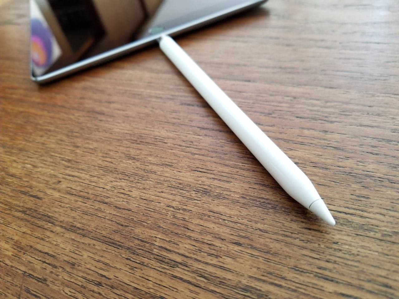
It’s been a long time since Apple blew anyone away with its “innovation” (Tim Cook’s favorite buzzword). Most of what’s been released in the Cook era has been iterative of the Steve Jobs era: Larger iPads. Smaller iPads. Bigger iPhones. Smaller iPhones. A stylus was added to the iPad but it was only addressing what third parties had been doing more clumsily for years. Yes, the cameras got better, the screens sharper — but so did literally everyone else’s (in fact, Samsung’s phones have long showcased higher resolution, more sophisticated displays). The software got more complex, but not necessarily more usable. Yes, Siri went from totally useless to “maybe it'll work this time.” And Maps improved, but still doesn’t provide the kind of detail or accuracy seen in Google’s product.
The Watch is perhaps the closest the company’s gotten to a truly new product since the introduction of the iPad in 2010, but if we’re keeping points, it’s a riff on several other watches that came before it (the Samsung Gear, the Moto 360), and the original operating system launched with the device was so poor that the company decided to tear it down and rebuild just two versions later. Oh and the latest Watch hardware release? Eviscerated by critics for its spotty and aggravating new features, like LTE that can’t connect, and a battery that won’t make it through a day. The Wall Street Journal’s Joanna Stern said, “After a week testing these new models ... the future feels even further away.”
Apple may be able to tout that it's the “No. 1” watchmaker in the world, but that doesn't mean it’s making good products.
And it's not just the hardware, or the UI. The ecosystem is unwell. iTunes and Apple Music and the Podcasts app coexist on devices for reasons only Eddy Cue understands, your purchases and files floating somewhere in their digital ether, untethered to a clear system or logic. The “TV” app maintains some awkward middle ground that attempts to lasso your subscription services, your purchased content, marketing suggestions, and the cable you probably still pay for. But none of these things seem to actually function fluidly. Example: you can buy movies and TV shows in the iTunes Store app but you have to watch them in the TV app? It’s fucking crazy.
It’s fucking crazy.
It’s almost as if the company is being buried under the weight of its products. Unable to cut ties with past concepts (for instance, the abomination that is iTunes), unable to choose clear paths forward (USB-C or Lightning guys?), compromising core elements to make room for splashy features, and executing haphazardly to solve long-term issues.
This is not an argument about what Steve Jobs would have done; this is an argument for a central, cohesive vision that accounts for systems, not just nodes on a network. Jony Ive is clearly not providing that vision. Phil Schiller is not providing that vision. And Tim Cook, the all-time don of supply-chain management, cannot and will not provide that vision. So what happens now?

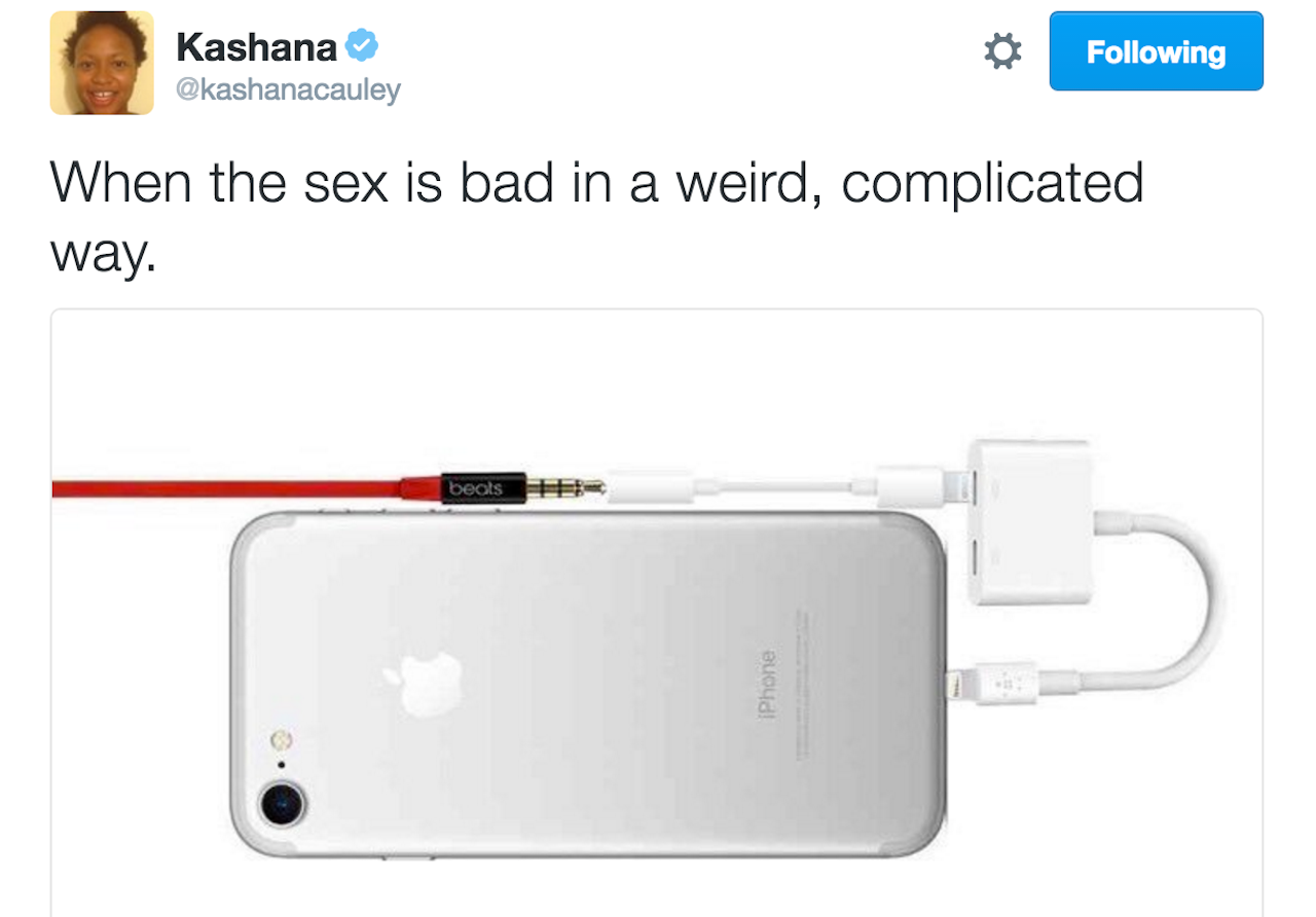
Pundits will respond to these arguments by detailing Apple’s meteoric and sustained market-value gains. Apple fans will shout justifications for a stylus that must be charged by sticking it into the bottom of an iPad, a “back” button jammed weirdly into the status bar, a system of dongles for connecting oft-used devices, a notch that rudely juts into the display of a $1,000 phone. But the reality is that for all the phones Apple sells and for all the people who buy them, the company is stuck in idea-quicksand, like Microsoft in the early 2000s, or Apple in the 90s.

Is it Apple’s unbridled and seemingly-endless success that has caused the company to rest on its laurels?
A threat to your existence can be an incredible motivator to adapt or evolve. Apple demonstrated this in the most profound way with the introduction of OS X — a clean break from its past that paved the way for the iPhone and all of the success that would follow it. But with victory often comes complacency, and in Apple’s case, that complacency comes in the form of design without thought, a self-congratulatory sense of your gadget stores as “town squares,” and an increasing lack of concern for what is coming next. In technology, that next thing is always the one that breaks you. Apple seems to have lost its knack for either envisioning the future, or expertly ripping off the people who do. Does Apple know what’s coming next?
I wonder.