Do you remember Winamp? Maybe you remember its tagline, “Winamp: It really whips the llama's ass”? Launched in 1997, Winamp was one of the earliest ways to listen to MP3s, making it possible to easily enjoy music on the desktop PC. It also had a completely skinnable interface, opening the door to some truly heinous fan-designed skeuomorphism.
Skeuomorphic design, where user interfaces emulate the appearance of physical objects, has been popular for pretty much the history of personal computing. The ideas of “files,” “folders,” and the “recycle bin” in Windows could be considered skeuomorphs, intended to help transition early computer users from analog to digital, as could the idea of an “inbox” and “outbox” in email and the paperclip that symbolizes attachments. More recently, a lot of early iOS apps were famous for their heavy-handed skeuomorphic elements, with felt textures and chunky drop shadows.
But no area of computing has so thoroughly gone for it more than audio software. The first Billboard #1 single that was recorded to a hard drive instead of tape was “Livin’ La Vida Loca” in 1999; 18 years later, in 2017, most audio software still looks like the designers attempted to replicate physical equipment piece for piece on a computer screen. Faders, switches, knobs, needles twitching between numbers on a volume meter — they’re all there. Except you have to control them with a mouse.
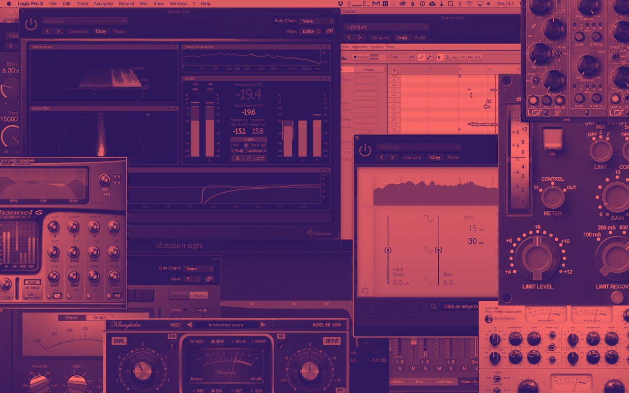
Winamp may have been Patient Zero in this gaudy epidemic, but it has spread far and wide. I spend a lot of my time mixing and editing audio, and that often involves having multiple audio plugins (essentially applications that run inside the main audio program) from multiple vendors running simultaneously. But all audio software, for what I suppose are historical reasons, features the most egregious skeuomorphic design in all of software.
Alone, each plugin is hideous in its own unique way. A panel of 3D knobs here, a pixelated oscilloscope there. But when a project really gets cooking, one can amass eight or ten of these interfaces overlapping each other on the screen at once, and that's when skeuomorph hell really comes into focus. I don't know why audio software has looked like this for the better part of two decades, but I'd like to honor these sins of UI with a tour of some of the most egregious examples.
It was difficult to choose just two plugins from audio software company Waves, since they all hazily resemble control panels from Bioshock. Their Butch Vig Vocals plugin, built to enhance and crunch up vocal tracks, inexplicably looks as if the inside of a Swiss watch was enlarged so as to serve as the primary control interface to a ship's steam room. Meanwhile, the Abbey Road J37 tape emulator plugin is designed to combine the vintage warmth of analog tape (and the striking visual effect of two large tape reels spinning) with the convenience of your computer. However, it spoils the nostalgia by reminding the user of what it was actually like to operate tape-based equipment.
Antares’ Auto-Tune pitch correction software has become so common in popular music that the plugin’s name is now genericized. But, as we've heard in the use of Auto-Tune itself, success does not necessarily translate to subtlety or taste.
Auto-Tune EFX 3, a stripped-down, cheaper, more basic version of the flagship Auto-Tune plugin, still looks like it was inspired by affixing Jolly Ranchers to the front of a tape recorder.
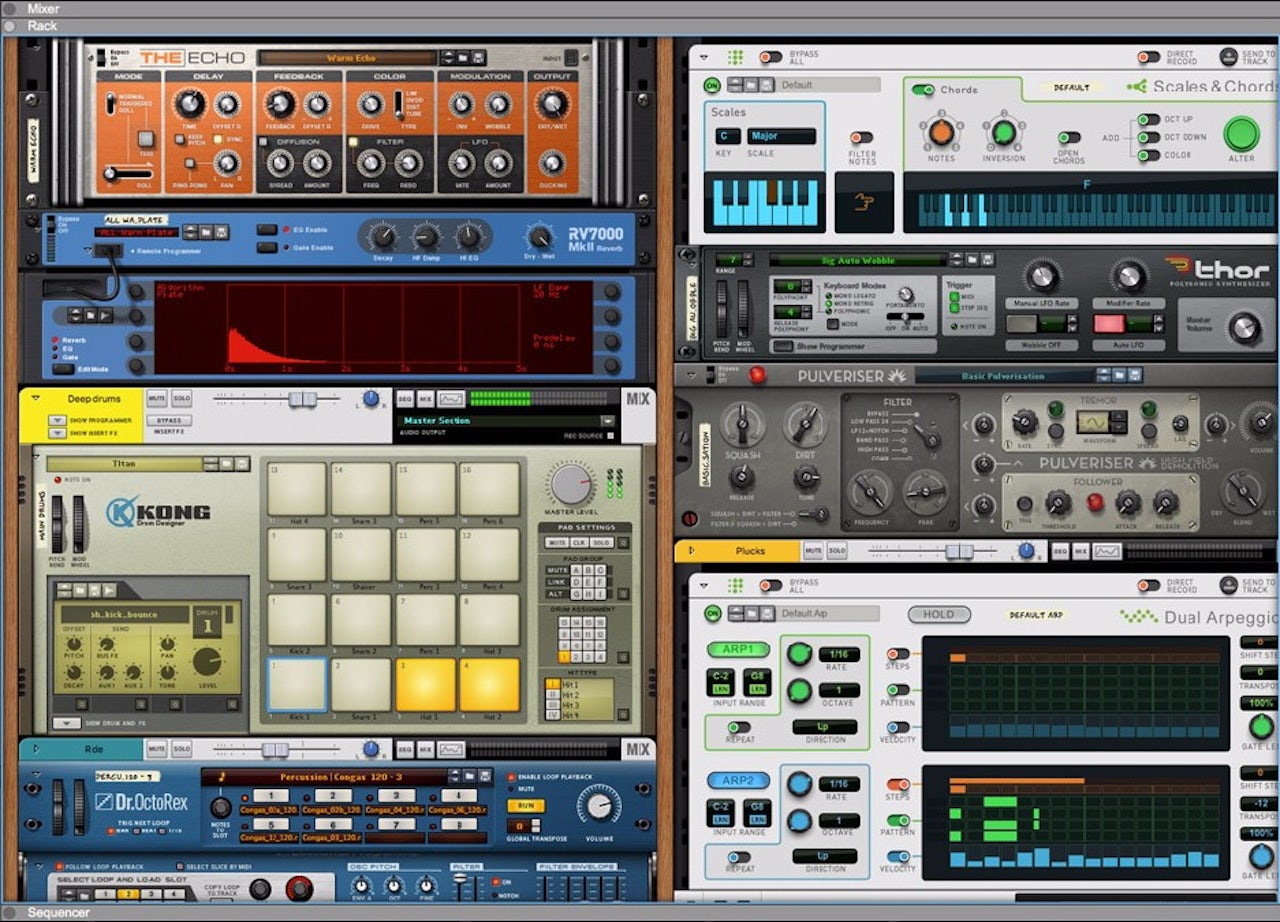
Propellerhead’s Reason, which has boldly resisted any sort of visual change since its inception in 2000, is a digital audio workstation designed to mimic the flexibility of a studio rack full of analog equipment. Unfortunately, it also mimics the look of such a rack, down to barely-color-coded cables which flop and bounce adorably as you struggle to connect them between rack modules.
Logic is an extremely popular and powerful piece of music software. It was developed in the early 1990s by a German company called Emagic, and it had a distinctly 90s look, replete with faux metal knobs and textured panels. The software was bought by Apple in 2002, and they worked over time to change the aesthetic from bright and skeuomorphic to… dark and skeuomorphic in a slightly different way. (Incidentally, GarageBand is now essentially a stripped-down version of Logic.) For example, in 2013, with Logic Pro X, the Mixer window got a toned down, less LED-centric redesign. (But if you miss the old mixer, don’t worry: for some reason it still exists. Open the obscure Environment window, and there’s the 2009 version of the mixer; you can drag it over the 2013 mixer and see both interpretations at once.)
Pod Farm, from amp simulator pioneer Line 6, gives you the wood grain and imitation leather you’ve come to expect from guitar-centric audio plugins. It also features circular rotating knobs, surely the most pervasive/least useful UI element in this type of software. A circular control is extremely difficult to operate precisely with a mouse, but no matter; they look “cool,” or something.
Why are these knobs shaped like teardrops? What are those handles for? Why hasn’t someone cleaned the brushed metal or tightened the screws? Only Antelope Audio, which makes these “vintage” plugins, can know for sure.
I’ve been using Logic for around eight years, and in that time, its built-in ES2 synthesizer has not changed. I have also not come closer to understanding what any of its controls do, or why they are laid out like this.
Maybe these designs make some musicians feel more comfortable, or more inspired. After all, they hearken back to a time when physically fiddling with knobs and flipping switches was very much a part of making music. But modern music software is designed to work completely “in-the-box”; everything gets made inside the computer without any external hardware. That means there are no wires or sliders involved in making sounds. And especially now that a generation of musicians has been raised on GarageBand and iPads, does it really make sense to cover a piece of software in wood paneling? The rest of computing has moved on from felt and brushed aluminum, and this is getting embarrassing.


