You may have noticed that Donald Trump is a low quality president. If you haven’t, and you think his record low approval ratings, multiple criminal investigations, and general contempt for human life is just fine, you can still probably recognize that his administration’s web aesthetic is strikingly and consistently ugly.
Yellow tints. Poor lighting. Quotes with weird punctuation in random fonts. Images stretched and pixelated, which is bizarre in an era when your standard iPhone produces images that are 3264 by 2448 pixels. Every image and video posted to the Obama White House social media accounts was high resolution and skillfully composed using a consistent design language. By contrast, Trump’s team churns out poorly-lit, amateurishly framed photos and videos that look like summer camp montages made in iMovie.
WELCOME HOME, AYA!#GodBlessTheUSA🇺🇸 pic.twitter.com/CR4I8dvunc
— Donald J. Trump (@realDonaldTrump) April 21, 2017
For example, this video was tweeted by Trump in April to welcome Aya Hijazi, an Egyptian American charity worker who had recently been released from wrongful imprisonment in Egypt, back to the United States. The video opens smack in the middle of a line of the Lee Greenwood country song-come-patriotic-anthem “God Bless the USA,” atop a stock graphic of a rustling U.S. flag. [Cross fade in]: A scrolling Washington Post article about the Trump administration’s role in getting Hijazi free. A few seconds later, the ceiling of the Oval Office abruptly fades to a poorly-lit clip in which shadows wink in and out before the camera pans down to focus on a conversation between Trump, Hijazi, and others. The rest of the video consists of photos edited with the so-called “Ken Burns effect,” a freshman year film school tactic in which the camera zooms in or pans over a still photograph.
When the entire production ends (again, mid-lyric), we’re treated to a block-lettered, low-resolution welcome sign, superimposed over yet another photo of Hijazi and Trump. The overall aesthetic effect is violently garish.
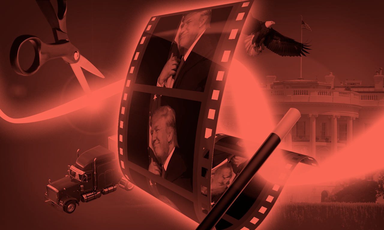
This has become a pattern for Trump: poorly-edited digital content in which serious and significant subjects are given bad color treatments, low resolution, and carelessly incorrect accoutrements, like in this video featuring the former Taoiseach of Ireland, where, instead of the shamrock — a culturally significant symbol of Ireland — the ending frame of the video features a four-leaf clover, a symbol more typically associated with the Lucky Charms leprechaun.
There’s also the infamous truck video, taken in March of Trump at a campaign rally(!) in Kentucky, and this more recent video that attempts to pull a “They said it first!” sort of defense of the firing of FBI Director James Comey. The stylistic resemblances amongst these are remarkably consistent, even when we go back to the pre-election era to watch this catty Gill Sans Bold-fonted anti Marc Rubio clip from March 2016, and another rally mini-doc from October 2016 in Arizona, in which the state flag is clumsily pinned to a corner of the screen throughout the video.
It was an honor to welcome so many truckers and trucking industry leaders to the @WhiteHouse today! pic.twitter.com/M1veooVBNE
— Donald J. Trump (@realDonaldTrump) March 23, 2017
Is this awkward, lo-fi aesthetic purposeful, or another arena of Trumpian incompetency? Dan Scavino Jr., the White House director of social media, has a Twitter account that is similarly teeming with amateur-quality visuals, including photos where the subjects are looking away from the camera or the frame is askew or otherwise strangely composed.
“It probably feels like it's something out of a time where they felt the government was more aligned with their interests.”
To some, these flaws may actually signal the scrappy authenticity that Trump has tried to lay claim to. According to Paul Berry, founder and CEO of digital publishing platform RebelMouse and former CTO of The Huffington Post, Trump’s unrefined media presence may be exactly what is appealing to his supporters. “When you polish everything and make everything perfect, then that's what people don't want anymore,” Berry told The Outline.
Berry doesn’t believe the imperfections in the videos posted on Donald’s personal Twitter account are purposeful, but the lack of shame, or of any attempt to improve the quality of the videos, echoes the way that Trump has gone about his presidency. “You do feel it's the real him. ‘This is me, this is just who I am, this is...’ like, bad lighting and all,” he said. “It's like hashtag #nofilter is Trump.”
Join the MOVEMENT!https://t.co/3KWOl20zMmpic.twitter.com/BS5JLelPJd
— Donald J. Trump (@realDonaldTrump) October 4, 2016
Lauryn McCarter, the resident User Interface and User Experience designer at New York Code and Design Academy, believes that Trump’s old-school visuals are a citation of a particular time.
“Talking about the resolution and the editing specifically of the video quality there, we're looking at something from a couple of decades ago, and that's when I think a lot of his base was probably more comfortable,” she told The Outline. “It probably feels familiar. It probably feels like it's something out of a time where they felt the government was more aligned with their interests. And it probably feels like it's not as slick, not him trying to be a politician.”
Being “a politician” of course, is the same shorthand that Trump himself has used to imply that politicians are generally dishonest, a claim that simultaneously shores up his own suitability for the office of President by suggesting that his inexperience as a politician is a positive attribute. According to McCarter, the poorly-made videos do the same work of convincing viewers of Trump’s unique suitability by virtue of the videos’ very unsuitability. “I think what a lot of people like about the president now is that he doesn't seem like a highly produced person, or he's presenting himself as not being a highly produced person. But you know, I mean he was a reality TV star so he certainly has plenty of experience being highly produced.”
Rather than accept the idea that such a high government office is full of inept people bad at their jobs, it’s tempting to imagine that this is a carefully put together aesthetic; a deliberately grotesque pastiche of Reagan’s sentimental soundtracks and Bush’s slow pan and zoom campaign ads, constructed as a nod to the nostalgic yearnings of Trump’s #MAGA base.
We can see this in organizations politically adjacent to Trump as well: In February, far-right publication Breitbart conducted an interview with White House Press Secretary Sean Spicer that instantly became meme fodder due to its supremely awkward camera work and resemblance to public access television. Across the northern border in Canada, Conservative MP and 2017 candidate for Party leadership Kellie Leitch, known for her stance that all immigrants and refugees entering Canada be screened for “Canadian values”, released an excruciating 8-minute video featuring a roaming camera, innumerable dramatic pauses, and a candidate that couldn’t seem to decide if she wanted to sit or stand. And last year, “All In with Chris Hayes” spotted a television ad sponsored by a pro-Trump PAC that had graphics right out of an infomercial.
What seems more likely is that the 70-year-old Trump and his officials don’t recognize the fact that their videos look outdated and amateurish. To Trump’s communications crew, “badly Photoshopped” headers and “breathtakingly lazy” montages are perfectly acceptable; mediocrity after all, doesn’t matter when you have a bed of desperate, angry, nationalistic constituents upon which to rest your head.