When I close my eyes and think of a word, I picture that word in Gotham. I am cursed with the compulsive need to identify every typeface I come across, but even if you do not suffer this particular affliction — if your relationship to typography resembles your relationship to air, a constant interaction so seamless you hardly think about it unless something goes seriously awry — you know this font. If you’ve been online, seen a billboard, gone to a movie theater, or walked down the street with your eyes open, you’ve seen Gotham.
Gotham is a typeface first designed in 2000 for GQ and released for public use in 2002. An abbreviated list of where it has appeared includes: Coke bottles; Twitter; Spotify; Netflix; Saks; New York University; The Tribeca Film Festival; TV shows including CONAN and Saturday Night Live; movies including Inception, Moneyball, The Lovely Bones, and Moonlight. If the advertisements in the train stations and bus stops in your city don’t use Gotham, they probably use a Gotham look-alike.

Gotham is everywhere, as the name of one of the Tumblr accounts dedicated to tracking its prevalence suggests, but how did it become so ubiquitous? How does a typeface take over so thoroughly in such a short period of time — and what do advertisers across every industry like so much about it?
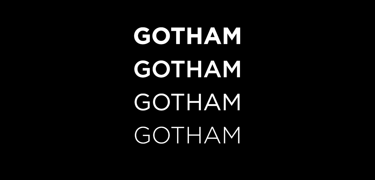
The simplest answers are the technical ones. Gotham is a geometric sans serif — sans serif meaning it lacks the little feet in the corners of letters you’d see in a typeface like Times New Roman, and geometric alluding to the influence of basic shapes in its design. It has a high x-height, meaning that lowercase letters like x and e are comparably large, and its different weights — bold, thin, medium, et cetera — are very distinct from one another. All of this is to say that Gotham can be easily read from a distance on a billboard or sign, making it a natural choice for print advertising.

In fact, Gotham finds its typographic roots in much of the 20th-century architectural signage commonly found in New York City. Oddly enough, the geometric signage on the front door of the Port Authority — not a place many people associate with hipness — served as an inspiration for Gotham’s creator, type-industry titan Tobias Frere-Jones.
“The goal was to find a straightforward voice — even stark,” Frere-Jones told me over email, “and the Port Authority Bus Terminal lettering was a promising example of that voice. I was also concerned about making a new geometric sans when there already so many…I hoped that this non-typographic source could yield something memorable in such a crowded field.”
There’s also the more nebulous and encompassing question of style. Gotham has been described by Frere-Jones as “fresh” and “masculine” (it was, after all, initially intended for GQ); Michael Beirut, who designed Hillary Clinton’s 2016 logo, once described it to Newsweek as a “sleek, purposefully not fancy, very straightforward, plainspoken font.”
It’s difficult to untangle what goes into the distinction of a typeface as “masculine” – is it the blockiness or the letters, for instance, or the straight and authoritative lines that prompt the association? In the context of GQ, Gotham’s unfussy directness and authority could certainly be read as masculine, especially in its heavier weights – but in the lighter weights, paired with the right color palette, it could easily read as an elegant, feminine typface. It’s a font that swings both ways!
Perhaps that combination of sleekness and plain-spokenness is the most crucial factor in its rise to prominence. Gotham is, in many ways, a blank slate, able to be used stylishly in a wide variety of contexts while imbuing its surroundings with a bit of down-to-earth, “plainspoken” elegance.
This includes even the most somber contexts. In 2004, a 20-ton cornerstone was laid at the site of the restored Freedom Tower, bearing the inscription “To honor and remember those who lost their lives on September 11, 2001 and as a tribute to the enduring spirit of freedom.” The inscription was chiseled in Gotham, which had only been recently released by Hoefler & Co. for public use. (Incidentally, licensing a font like Gotham isn’t cheap – a basic package of Gotham in four weights with and without italics runs for $199 on typography.com.)
One of the most iconic and widely received messages ever laid out in Gotham consisted of a single word: “HOPE.” Initially, the Obama campaign used Perpetua, a serif typeface in line with Hillary Clinton’s use of New Baskerville, in its logo and brand materials. But with the addition of new designers on the team, the campaign took a very different visual direction, paving the way for a re-election campaign that would prominently feature Gotham in its original and custom slab serif forms.

The new branding — and most notably, the “HOPE” poster — made a lasting impression in the world of political design. At the time that Obama switched over to Gotham in 2008, more traditional serif typefaces dominated the political sphere; now, in the 2020 primary, geometric-leaning sans serifs are all the rage, along with bold colors well outside the traditional red and blue palette.
“I think the whole Obama design program changed the look of politics,” said Frere-Jones, “[and] Gotham happened to be a component of that. Campaigns are now very aware of their typography, across the political spectrum.”
Maybe its plain-spokenness allowed Gotham to pivot the look of Democratic politics into the 21st century; in that same Newsweek interview, Michael Beirut noted that “unlike other sans serif typefaces, it’s not German, it’s not French, it’s not Swiss. It’s very American.”
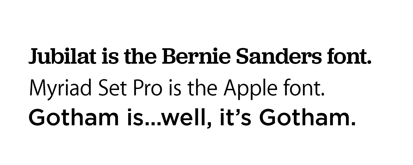
But what makes the Gotham phenomenon extraordinary is the way in which it has been used across countless industries for innumerable products and brands while transcending its association with any particular one. If I showed you a sentence typed in Jubilat or Myriad Set Pro, both of which have some letter-construction similarities to Gotham despite looking very different, you would likely recognize them as the typefaces used by Bernie Sanders and Apple, respectively.
But you likely wouldn’t immediately peg Gotham as “the Obama font,” or “the Saturday Night Live font,” or “The Spotify font,” would you? In its universality, Gotham resists being pigeon-holed, allowing it to be used by major brand after major brand without becoming stale.
In the nearly two decades since Gotham’s arrival, the already well-populated field of pared-down sans serifs has seen an explosion in the world of advertising. Gotham look-alikes including Raleway, Montserrat, and Gibson have taken up the mantle of clean, straightforward sans serifs, alongside Gotham progenitors like Avenir and Proxima Nova.
But it’s not just a matter of typefaces; the popularity of sans serif is part of a constellation of trends within a major shift toward minimalist design. Millennial-targeted fashion brands such as Glossier and Thinx and app-based companies such as Postmates, Lyft, and AirBNB are the most aggressive adoptees of this style, with flat photography, solid color backgrounds, copious white space, and geometric sans serifs characterizing the vast majority of their design schemes.

The minimalist moment has been characterized as a millennial phenomenon, and it’s not hard to see why; across the worlds of fashion, art, interior design, and social media platforms like Instagram and Pinterest, young people appear to prefer stripped-down aesthetics — or at the very least, stripped-down aesthetics are being thrust upon them.
There are some grim implications to the millennial minimalist trend: young people have inherited a world with far less to offer them that it did their parents, and for most, decadence is simply unattainable. If we’re finding elegance and sophistication in the plain, perhaps it’s out of little more than necessity, paired with the comfort of clean lines and legible boundaries in a world that is constantly, collectively losing its shit.
All trends fade eventually, and some have predicted that millennial minimalism is already headed out the door. What will follow depends, in large part, on what we will need in order to make sense of the world five or ten years down the line, and what new advertisers will create in order in order to satisfy for us.
The geometric sans serif may soon go the way of the now-lame Times New Roman. But I tend to believe that Gotham is here to stay. It’s stood understatedly in the background of iconic moment after iconic moment of the 21st century, like the Forrest Gump of fonts. Even as trends come and go, Gotham has continually proved its exceptional sticking power.
“The pendulum never stops,” said Frere-Jones. “The wave of stripped-down sans serifs is already starting to show its age, and some corporate identities are already turning away from it. But being clean and straightforward never really goes out of style, even if it needs a new expression.”