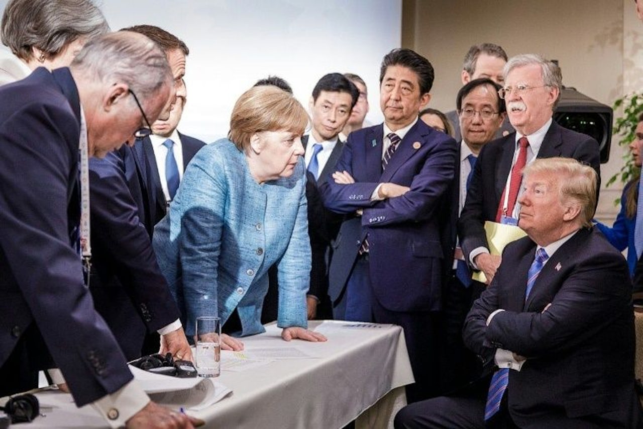
Last Saturday, the German government released an official photograph from the G7 summit depicting German Chancellor Angela Merkel and her fellow world leaders, captioned as a “spontaneous meeting between two working sessions.” In the picture, taken by German photojournalist Jesco Denzel, Merkel appears to command the attention of the entire room: surrounded by a nearly all-male group, she stands over the table, her sky-blue suit standing out against a sea of diplomatic navy, to stare down Donald Trump, who looks typically petulant, sitting in the corner with his arms crossed. Unsurprisingly, the photograph went viral, and art historians let out a collective groan as the by now inevitable refrain followed: “This looks like a Renaissance painting.”
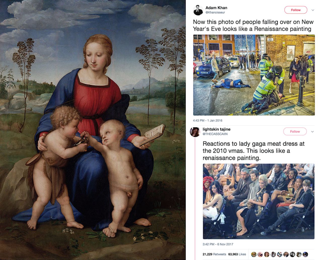
The notion that a modern photograph might bear resemblance to Renaissance art has become a bona fide meme. It dates back to 2014, when an admittedly fantastic photograph of a fistfight in Ukrainian parliament began circulating online with a diagram of a Fibonacci spiral — popularly, though questionably, believed to have been used by Renaissance artists as a model of ideal proportions — superimposed on top. Outlets from the Guardian to Buzzfeed began collecting other examples of photographs that they deemed similar to Renaissance paintings: a tableau of drunks on New Year’s Eve in Manchester, professional soccer players celebrating after a goal, politicians yelling. Every few months, a new entry comes along; a subreddit devoted to the topic, r/AccidentalRenaissance, currently has more than 400,000 subscribers.
The subjects of the various viral photographs described as being “like a Renaissance painting” are diverse, but they tend to have two things in common: they are dramatic depictions of multi-figure groups, and they look nothing like Renaissance paintings.
Listen to more thoughts from Rachel Wetzler on The Outline World Dispatch.
In the case of the G7 photograph, @palle_hoffstein pointed out in a self-described “pedantic as fuck” rebuttal that its composition was more characteristic of the Baroque than the Renaissance proper: paintings from the former time period, he argued, are “evenly spaced across the canvas, equidistant to the viewer as if on a stage,” as in Botticelli’s Primavera (c. 1482). By contrast, Baroque paintings, like those of Caravaggio or Rembrandt, are oriented around a diagonal axis and typically employ an exaggerated chiaroscuro — the contrast between areas of light and shadow — known as “tenebrism'” to create a sense of heightened narrative drama.
Hoffstein’s observation is basically correct — but only in the most superficial sense. Botticelli was something of an outlier among major Quattrocento painters, and the more common hallmark of Italian Renaissance paintings is the pyramidal composition — a complex, broadly symmetrical arrangement of figures rationally set within an illusionistic depiction of deep space (see, for instance, Leonardo’s Madonna of the Rocks, or Raphael’s Madonna of the Meadow).
What Denzel’s G7 picture actually looks like is, well, precisely what it is: a well-composed photograph. If it bears any limited resemblance to Renaissance (or Baroque) artworks, it’s because Renaissance Italy is when and where most of the major conventions of Western pictorial composition were first established. Saying that it resembles a Renaissance painting is about as useful as calling any tragic scenario “Shakespearean.”
It’s another viral-ish tweet about the G7 photograph by @mikeduncan — “This looks like a history painting that took years to plan, compose, and complete” — that inadvertently hits on the real problem with calling all good photographs “Renaissance paintings.” A photograph by definition does not take years to plan, compose, and complete. Rather, as Henri Cartier-Bresson wrote in his introduction to The Decisive Moment, among the canonical texts of 20th century photography, the production of a photograph involves “the simultaneous recognition, in a fraction of a second, of the significance of an event as well as of a precise organization of forms which give that event its proper expression.”
In other words, the photographer’s skill is a matter of both vision and reflexes: the ability to identify the composition in an instant as an event is in the process of unfolding and push the button before it swiftly disappears. While likening a well-composed photograph to a Renaissance painting is presumably intended as a compliment, but it arguably works to erase the actual accomplishment involved in making a compelling photojournalistic image.
In his 1972 book Painting and Experience in 15th Century Italy, the art historian Michael Baxandall described Renaissance paintings as “the deposit of a social relationship,” involving the painter on one side and a patron on the other. Baxandall coined the term “period eye” to describe the historically contingent nature of visual interpretation: pictures were not only shaped by the specific context in which they were produced, but also designed to address a viewer socioculturally primed to receive them.
The average Florentine merchant, for instance, would be intimately familiar with both mathematical proportions and the Bible, enabling him to appreciate the perspectival construction of, say, Piero della Francesca’s Arezzo Annunciation fresco, as well as the nuances of the story it describes — modern Christian viewers might recognize the basic scriptural contours of the “Annunciation” scene, but are unlikely to appreciate, as Baxandall’s 15th century “church-going businessman” can, the subtle distinctions between one type of Annunciation and another. A contemporary photograph simply can’t be “like a Renaissance painting” because it partakes of another kind of social relationship, conditioned by a different set of conventions for making and seeing images.
I suspect the tendency to find “Accidental Renaissance” paintings in contemporary photographs says more about our own “period eye” than any real compositional similarities (after all, placing a Fibonacci spiral on top of an image doesn’t reveal anything except a basic knowledge of Photoshop). Photographs and paintings are fundamentally different types of objects, but that distinction is literally flattened when viewed on a screen: this is the logic of the Google Image search grid, algorithmically sorting JPEGs on the basis of loose affinities between data points. Likening every viral image to a Renaissance painting only makes sense when they are both perceived first and foremost as images untethered to material supports or different kinds of artistic labor. So please, just call such images what they are: great photographs.