
Uh, what does Antarctica actually look like?
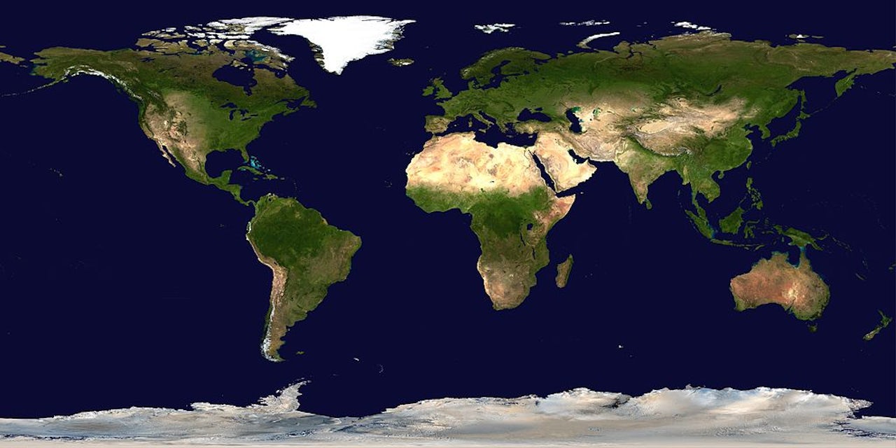
Most maps that show Antarctica are insanely bad. Typically, you get a sense of where the other six continents are (who cares?) and the best continent of all, Antarctica, the place least distorted and adulterated by greed (well, maybe not for much longer) necessarily gets distorted at the bottom of the map, looking like a sad, smudged border of vanilla frosting. Tragic.
Thank god, Robert Allison from SAS Analytics is here to help. According to his blog (which, full disclosure, advertises the services of his company), Antarctica is best shown by itself, the star of the show. Allison writes that it's also useful to show degrees latitude linearly, like minutes on a clock, and longitude radially, like the inside of an onion. Doing this actually gives you a sense of how Antarctica is positioned relative to the earth as a sphere.
In case you missed it, here is an example of a map of Antarctica that is good.
Please follow this advice and stop supporting bad maps of Antarctica. Thank you.