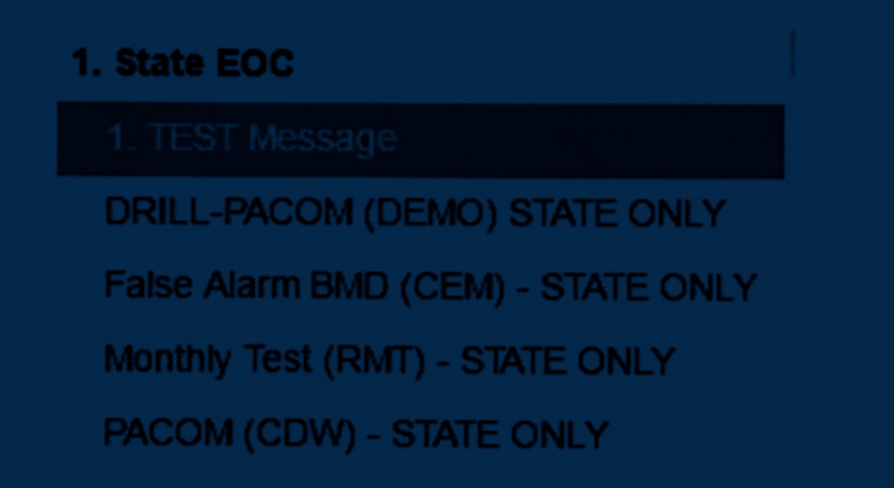
When an employee of the Hawaii Emergency Management Agency accidentally sent out a terrifying alert about an incoming ballistic missile to cell phones across state, Americans wondered how someone could make such a colossal mistake. This week, when state officials released an image that was at first reported to show the software the unnamed employee used to send the alert, the reason became more clear: The user interface was just a list of blue links, heavy with acronyms and no clear distinction between the test and the real thing.
“When you don’t pay attention to design, it’s like squeezing a balloon animal,” said Anne Hjortshoj, manager of user experience research and strategy for Cisco Cloud Security. “The problems always show up somewhere. You can’t ignore design in a disaster alert system.”
The image — and the follow-up revelation that it was just a mockup that had fooled the Hawaii governor’s office — sparked a lively discussion among interface designers like Hjortshoj, who pointed to the debacle as an example of why it’s important for the government to fund effective design in software systems.
“Any critical system, whether it’s in a hospital or a critical alert system for public safety, should be specifically designed to prevent errors like this,” said Kim Flaherty, a design expert at the research firm Nielsen Norman Group who wrote an analysis of the failure, in an interview with The Outline. “If a system is designed appropriately, errors should be very hard to do.”

If Flaherty were designing an emergency alert system, she would recommend a number of features. Most importantly, the system would have two modes — a sandbox mode for testing purposes, like the routine drill the employee was trying to select, and a separate one for live alerts that would be differentiated by clear visual cues.
A better system, Flaherty said, would also require a user to complete a small task before the system would send a critical alert. It could be as simple as a CAPTCHA image or two-factor authentication, or it could require another employee to separately authorize the alert. Systems that simply ask if a user is sure they want to take an action, as the Hawaii system reportedly did, are notoriously ineffective, she said, because people get used to clicking them every time.
All the web design/UI folks freaking out about this:
— Andrew Thaler (@DrAndrewThaler) January 16, 2018
I have some bad news.
This is what the entire back-end of the US government looks like. https://t.co/qlxXYZGxUA
Flaherty would also recommend clearer copywriting and better on-page organization, since the options on the image Hawaii are released are ordered strangely and laden with acronyms like “PACOM” and “CDW.”
“The wording and the way these are written up is very cryptic,” she said. “It takes a lot of mental work to differentiate between these. If this is getting tested once a week, someone’s going to eventually push the wrong button.”
Flaherty would also recommend a function that would let the state immediately send a second message to call off the first — which Hawaii eventually did, but only after 38 agonizing minutes as residents scrambled for cover, tried to find more information, and even texted their families to say that they loved them.

Hawaii reassigned the employee who was responsible for the mistaken alert, but did not identify the person by name. Members of Congress intend to explore how the alert was sent out.
A Hawaii Emergency Management Agency slide deck suggests that nuclear war is a topic of concern for state officials: one slide shows a missile taking flight with the North Korean flag crudely pasted onto its side, and another depicts a post-apocalyptic wasteland with under the words “nuclear holocaust.”
That concern may not yet have inspired an agency-wide commitment to digital security. Sharp-eyed newsreaders also noticed that back in July, an Associated Press photo of a Hawaii Emergency Management Agency computer console shows what appears to be a password, written on a sticky note and affixed to one of the monitors.
Jared Spool, the founder of research group User Interface Engineering, located a screenshot by AlertSense, one of FEMA’s approved vendors for alert software. The screenshot shows a more sophisticated interface than with the simple system Hawaii used to send the alert, with a prominent box marking whether a message is a test. It’s not clear what software was shown in the image Hawaii released this week.
Though Hawaii’s system may have lagged, the federal government has often engaged with the design community in recent years. The U.S. Department of Health and Human Services runs a site, Usability.gov, which lists advice and best practices for the design of websites and other interfaces created by the government.
Still, pushing changes through layers of bureaucracy can be maddening. Back in 2014, an employee of the General Services Administration assembled a presentation for government employees who want to modernize and maintain government websites.
Its title, complete with a still frame of Jack Nicholson bursting through a door in The Shining: “How to do UX in government without losing your freakin' mind.”