If you have red-green color blindness — like Facebook founder Mark Zuckerberg — Twitter might be a frustrating experience.
Jason Baldridge, a research scientist at Google who is color blind, noticed this when he realized that he couldn’t tell when he had “liked” something.
Hey @Twitter@support: I'm colorblind and can't see whether I've favorited a post when looking just at that post. (It's clear on timeline.) pic.twitter.com/vtmsYNqaXL
— Jason Baldridge (@jasonbaldridge) May 7, 2017
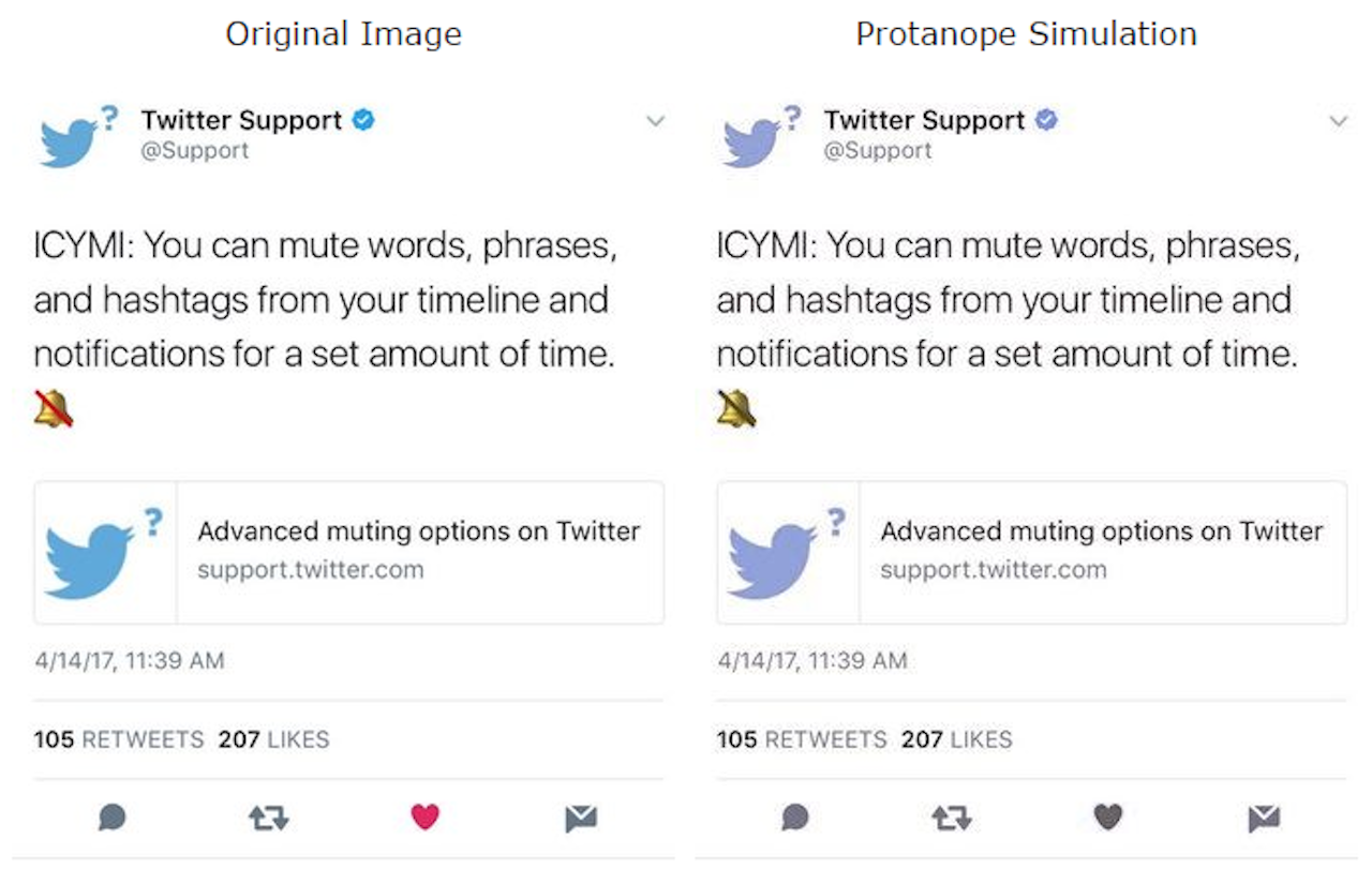
Vischeck, a tool that shows how something appears to a protanope, or someone with no working red cone cells, shows what tweets look like if you don’t have full color vision.

Baldridge’s experience with Twitter shows how easy it is to forget to make a website accessible to everyone. It’s not just the web that has trouble with designing for color blindness. Games such as Battlefield 3 have been criticized for designating between friend and foe using reds and greens that don’t immediately translate for colorblind players, leading them to not recognize when and what they should be shooting. Subways maps are another common problem area with multiple color-coded lines intersecting.
There are many different types of color blindness, but the most common form is trouble with reds or greens. According to the National Eye Institute, up to 8 percent of men and .5 percent of women with Northern European ancestry have red-green color blindness. A smaller number of people have trouble with blues and yellows and some even have complete color blindness. While the exact number of the population affected by color blindness isn’t clear, a 2014 study performed with preschoolers found 1 in 20 Caucasian boys had some form of color blindness.
Trello, a productivity software popular in media and computer programming, relies heavily on color-coded labels. In 2012, the company added a color blindness option that changed the labels to show patterns instead of relying solely on color. Trello even added a monochromatic version in 2014. Two Dots, a game about connecting colored dots, offers a similar solution by adding symbols to each type of dot in its colorblind mode.
Usability.gov, a website on user experience best practices and designs maintained by the U.S. Department of Health & Human Services, has a rather lengthy look at color blindness and web design that boils down to a single, universal sentence: Important information should never be conveyed by color alone.
Accessibility is an important consideration for design, given that an estimated 645 million people have some sort of vision or hearing impairment. Designing for all these possibilities in tech can be difficult, but not impossible; it’s also good business.
“On the web, usability is a necessary condition for survival,” wrote Jakob Nielsen, a usability advocate, in 2010. “If a website is difficult to use, people leave.”
Twitter did not respond to an inquiry about its stance on color blindness.