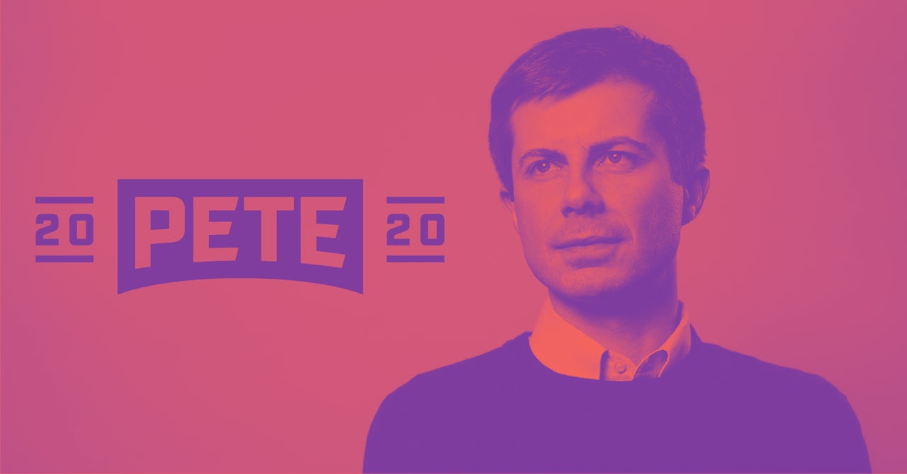
April 2019 was the month of Mayor Pete. After weeks of mounting media attention and intrigue surrounding the 37-year-old’s political prospects, Pete Buttigieg, the mayor of South Bend, Indiana, officially entered the Democratic primary on April 14, promptly landing him on the covers of TIME, New York, Out, and in a weirdly sultry black-and-white spread for Vogue. Along with stealing the hearts of many liberals, Buttigieg’s official campaign rollout contained a unique twist: as of the updated campaign website launch, his logos, fonts, color palettes, and other brand assets are all publicly available to download.
The move received rave reviews; Fast Company described the release of his design system for public use as “unprecedented” and “a radical new approach to campaign branding.” But the slicker Buttigieg’s brand looked, the more obvious it became that his website, the product of beautiful work by a chic Brooklyn design firm called Hyperakt, contained no political stances or policy proposals.
Over the past decade, graphic design has emerged as one of the most powerful brand cultivation tools that a candidate can have in their back pocket — one that, despite its influence on public perception, voters are unlikely to give more than a passing thought to. As the Democratic primary takes shape, and its small army of candidates are forced to reckon with the popularity of leftwing policy items such as Medicare for All and college debt relief, political graphic design has taken on a more specific role: an easy, subtle way to feint towards a progressive image without necessarily having progressive politics.
It wasn’t all that long ago that political graphic design was universally atrocious. Even into the 21st century, building a strong and appealing visual brand appeared low on presidential candidates’ list of priorities. Consider the logos of Bill Clinton in 1992 and Al Gore in 2000. Not only are they archaic and uninspiring even compared to the corporate design standards of the time, but they also traffic in a design language more or less identical to that of their Republican contemporaries — stodgy reds and navy blues; dull, clunky serifs fonts or boxy sans serifs; obligatory stars and/or stripes.


In 2007, a single letter uprooted everything. It’s hard to overstate how thoroughly and conspicuously the Obama “O” broke with every political design tradition preceding it. Sleek, simple, and exuding earnestness, the logo was unprecedentedly thoughtful — a design that actually attempted to represent its candidate’s core vision by imbibing the hopeful ethos that fueled Obama’s rise to prominence into a stylish, simple mark. Beside it, Hillary Clinton’s orthodox logo and John Edwards’ more-modern-but-awkward one (why put the shooting star off in the bottom corner?) looked like crude MS Paint creations, and the McCain branding seemed like an afterthought.


The Obama “O” functioned as the centerpiece of a notably well-coordinated design system that included “Yes We Can” merchandise and blue “Change We Need” signs held in the background of each rally. In a 2008 Newsweek interview, Michael Bierut, a partner at the preeminent design firm Pentagram, described Obama’s campaign design as “unprecedented and inconceivable.” “Every time you look, all those signs are perfect,” he said. “Graphic designers like me don’t understand how it’s happening.”
The central revelation of Obama’s campaign branding wasn’t even a particular aspect of the design — it was that they actually understood the political importance of aesthetics. The campaign’s success was by and large the result of an exceptional brand — simultaneously hip and earnest, futuristic, energized, unapologetically hopeful — that was expressed in simple, memorable, and unambiguous yet all-encompassing design.
The Obama campaign’s seemingly effortless emphasis on design set a high bar for all the Democratic candidates who have followed. Eight years after expressing shock over Obama’s graphic design, Bierut went on to design the logo for Hillary Clinton’s 2016 campaign — a campaign that maintained a massive, meticulously thought-out style guide and a user interface design system known as Pantsuit UI. Republicans continue to get off easy: their visual branding is often hideous, but in a way that effectively stokes the nostalgia of the conservative base (see: the MAGA hat) and distinguishes them from the competition. For Democrats, however, effective design can make the difference between a non-starter and a campaign bound for improbable victory.
Such is the case of Rep. Alexandria Ocasio-Cortez, who famously rose from near-total obscurity to defeat a powerful primary incumbent whose campaign outraised hers 10-to-1. While Ocasio-Cortez became an enduring media sensation overnight, her campaign branding garnered a news cycle of its own.
“At first I wasn’t sure if I was even looking at a campaign poster, but whatever it was, I knew I’d never seen anything quite like it,” n+1 publisher Mark Krotov said in an interview with Ocasio-Cortez’s designers shortly following her primary win. “That poster was the first I’d heard of Ocasio-Cortez, and she more or less had my vote right at that moment.”

Ocasio-Cortez’s campaign logo and print posters were products of Tandem NYC, a New York design firm founded by two of her friends. Krotov is right — the gold-and-purple color scheme, upward tilt, and speech bubble iconography make for an extraordinary and distinctive design, the sort of thing that might stop you in your tracks if you passed by it on the street. While its sleekness presents Ocasio-Cortez as a serious candidate intent on winning, the branding’s distance from the established Democratic visual language perfectly captures her spirit: a young radical, a political outsider, the person who everyone’s talking about.
The problem, of course, is that ostensibly hip, radical, “outsider” aesthetics are a tool that can be co-opted by those who, unlike Ocasio-Cortez, lack the politics to back them up. While a few establishment Democrats have held on to the safety of what worked last time — Joe Biden’s logo has been lampooned as a pale imitation of Obama’s, while Bill de Blasio appears to use Gotham, Obama’s signature font, in his logo — many have launched themselves in the opposite direction. In January, Sen. Kamala Harris entered the 2020 presidential election, unveiling a logo whose red-and-yellow color palette and condensed, boxy type paid homage to Shirley Chisolm’s campaign buttons.

Shirley Chisholm became the first black candidate and first woman candidate for the Democratic presidential nomination in 1972, after becoming the first black woman elected to Congress four years prior. A left-wing stalwart, Chisholm was fiercely anti-war, and refused to vote in favor of military budget appropriations during her time in Congress. Harris’s nod to Chisholm’s aesthetics in her logo feels momentous, and effectively projects the image of a valiant progressive interested in transformative politics. The image is, of course, unearned: Kamala Harris’s track record as a prosecutor, far from the “progressive” label she claims, is one of continual miscarriage of justice and expansion of the carceral state in California.
In pursuit of the grassroots’ ever-imperative support, candidates who have no business branding themselves as progressives or political outsiders are attempting to do just that, and design is increasingly serving as an easy shortcut for these efforts. This is how you end up with Wall Street-favored Kirsten Gillibrand winking at her detractors’ characterizations of her with a hot-pink accent color, or Pete Buttigieg opening his design vault to the masses while twisting himself into a pretzel trying to explain why those masses shouldn’t have access to free college. It’s hard not to get sucked in to the heart-tugging allure of a good brand, even if you know it��s a veneer for a far less inspiring agenda.
There may, however, be a natural limit to the efficacy of a carefully cultivated, unearned foray into outsider and populist aesthetics. Lindsay Ballant, the art director at The Baffler, compared the procession of cookie-cutter T-shirts and banners found at Hillary Clinton’s rallies to the handmade signs and fan art visible at Bernie Sanders’s in 2016. “Bernie’s campaign,” Ballant writes, “has harnessed the enthusiasm of the supporters who are, in turn, shaping his message, while Hillary’s top-down campaign messaging dictates to their voter base that this election is about her — the celebrity, the icon — not them.”
Political design is not immune to the pendulum effect; the trends of tomorrow’s candidates will likely emerge in direct response to what’s happening now. So long as current political dynamics remain the same, however, establishment Democratic candidates will still be pressed with the question of how to appeal to their increasingly left-leaning base without actually conceding to their policy demands. If the extensive coverage of 2020 candidates’ design choices is any indication, we’re entering a decade that will be shaped even more by visual branding than the last. It’s up to those on the left not to be fooled by those who use good design to obfuscate their milquetoast politics.