Peter Saville gave Burberry the same all-caps logo he gave Calvin Klein a year ago
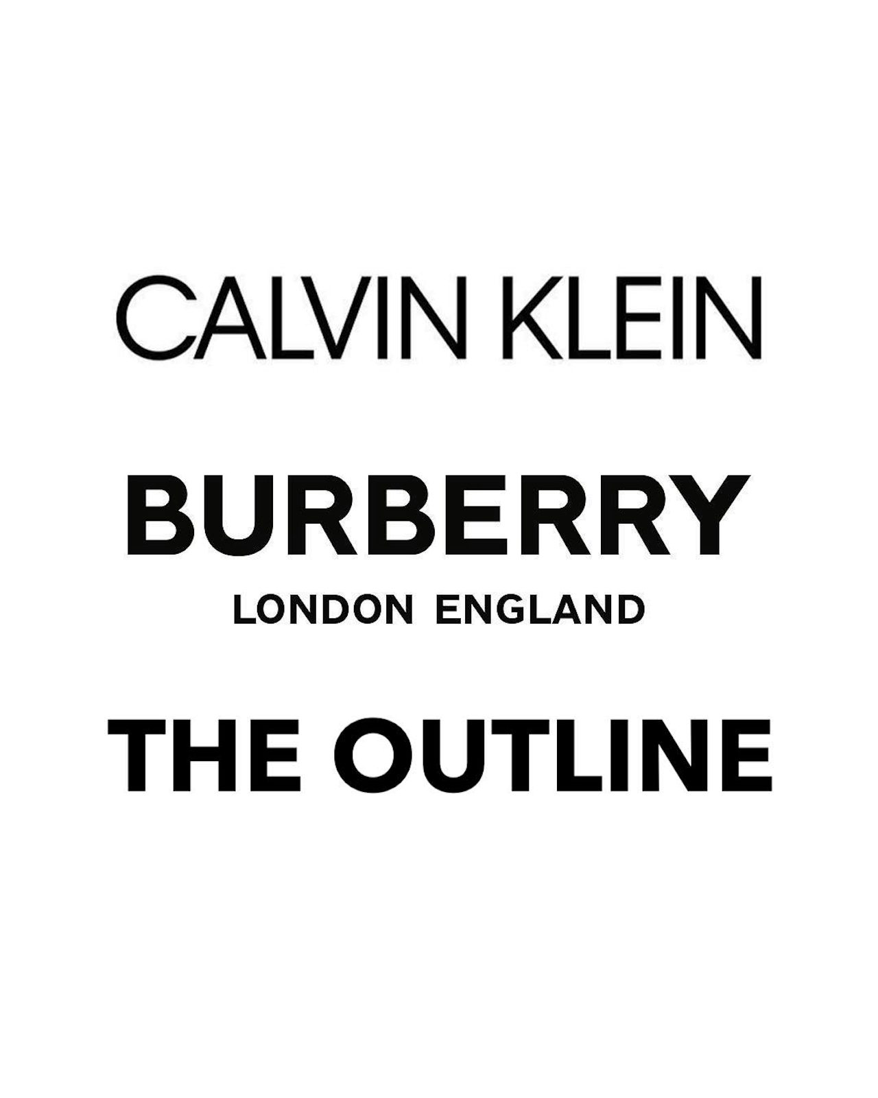
Pop quiz: Which of these logos wasn’t designed by Peter Saville?
Obviously, The Outline did not pay Peter Saville, the co-founder of Factory Records and iconic designer behind countless classic Joy Division and New Order album covers, to create a logo, because that would be very expensive. Instead, I, the Weekend Editor of The Outline, created this fake Outline logo in two minutes using the Preview program on my MacBook Air.
The fact of the matter, though, is Peter Saville has the easiest job in the universe, and fashion houses are suckers. Last year, he got paid money to take Calvin Klein’s regular logo and put it in all-caps. Because fashion is all about staying ahead of trends and forging your own lane, Burberry decided to get in on the action, and this year commissioned Saville to take the brand’s logo and put it in all-caps, too. It was unveiled, along with a new signature pattern of interlinked “B” letters (for Burberry), on the brand’s Instagram earlier this week.
This entire situation makes me think of Zoolander, and Peter Saville only has one look. I wouldn’t pretend that on some primordial aesthetic level that Saville’s two logos aren’t somehow different, and they’re definitely somehow better than the one that I made. If nothing else, there are definitely subtle differences in the two, such as the fact that the spacing between the letters in the Calvin Klein logo is pretty thin, and that the Burberry logo is bolded — but basically, they look like somebody got paid a shitload of money to whip up a thing in five minutes. Because I was bored, I decided to make my own logo for Burberry, which I spent ten minutes on: